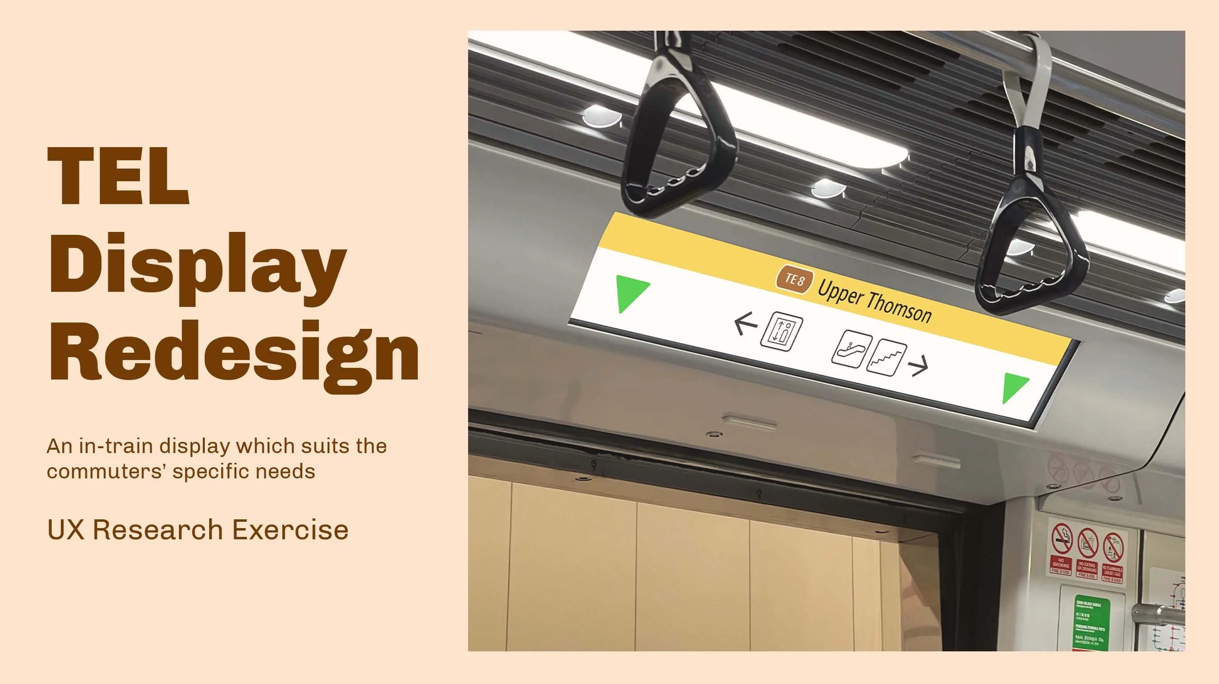
This is a personal study into finding the needs of commuters on the Thomson-East Coast Line, and redesigning the layout of the in-train information display to suit those needs.
Focus AREAS
UX Research
Project type
Personal project
Duration
15 weeks intermittent (Sep - Dec 2021)
The Background
TEL - The saving grace of bad train displays?
For many years, the displays of Singapore’s MRT trains have been scrutinised over its messy content and layout. But in 2019, a new train line opened, featuring a display with a simplistic design. Showing the bare essentials, it was even hailed as a huge improvement.
Or is it? Thus I embarked on a UX journey to determine the best information to be displayed, and laid out in a proper manner.
THE SOLUTION PREVIEW
The saving grace of bad train displays. (for real now)
‘Competitor Analysis’
Precedent studies from other train lines
I started by looking at other passenger information systems - from the STARiS (displays used in the NSL and EWL) itself, to those found in other cities, searching for possibilities for features.
The Research
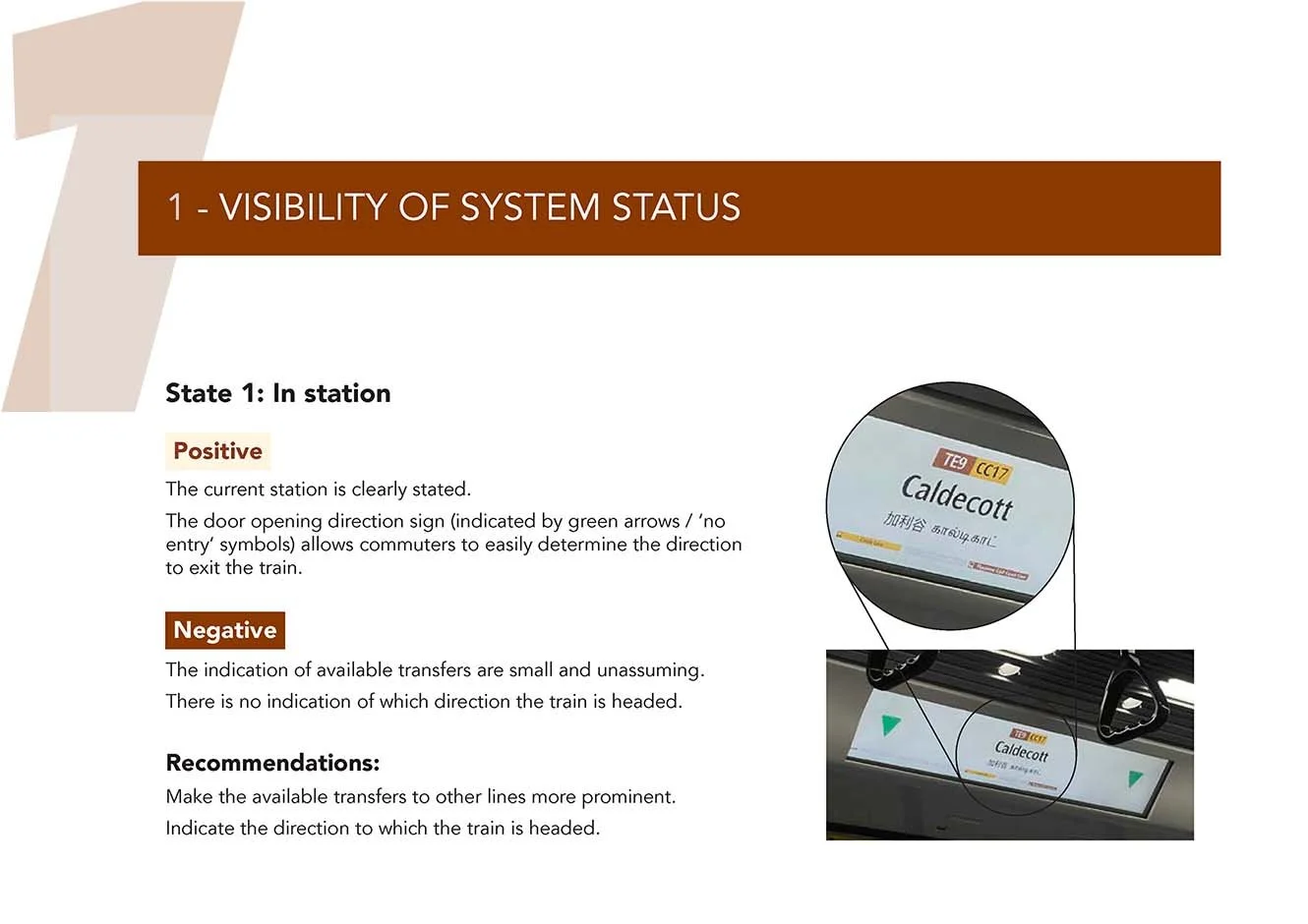
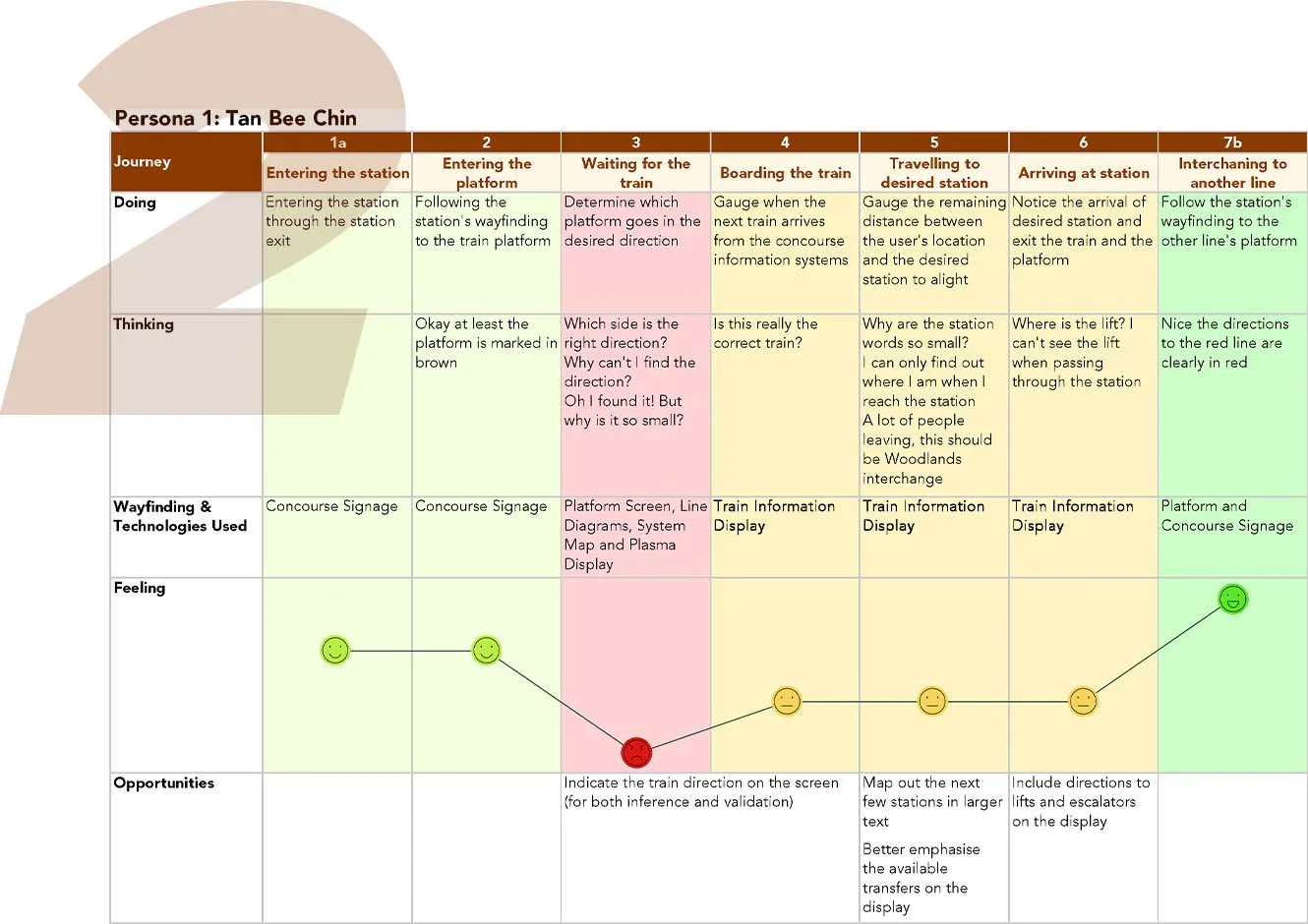
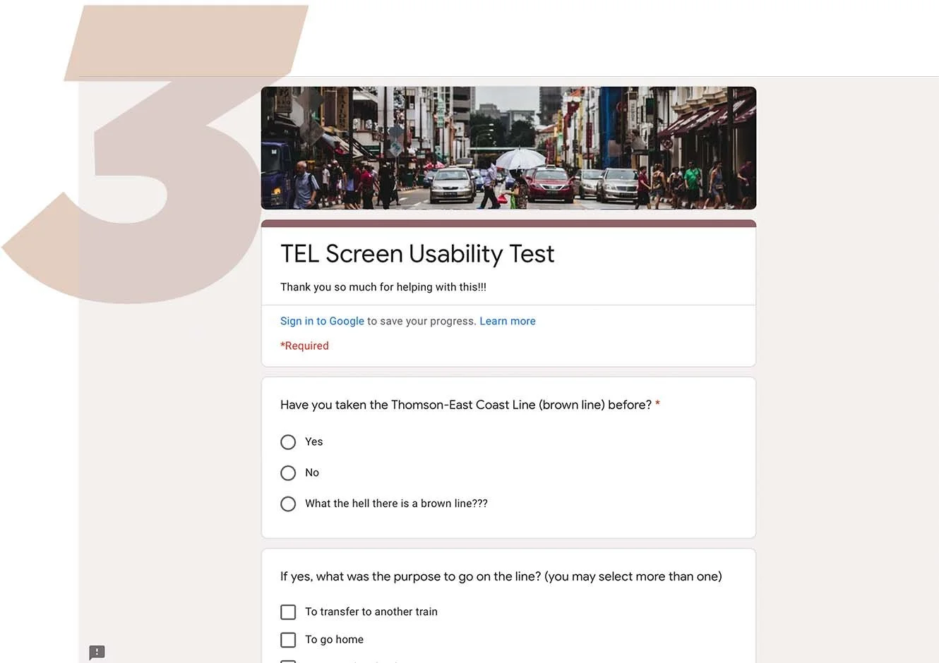
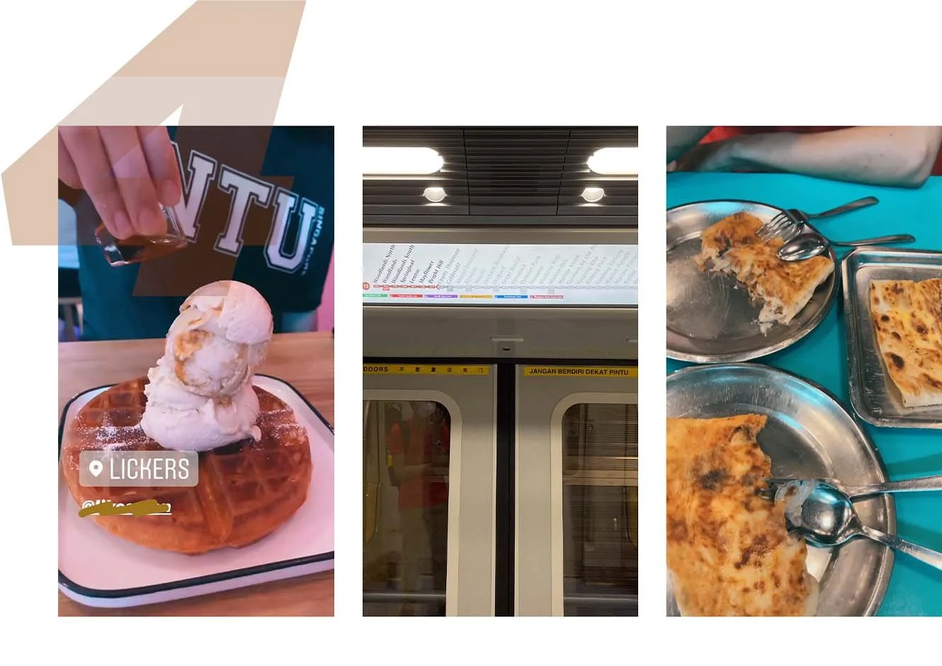
I then conducted several evaluations and tests to determine common pain and pleasure points faced by commuters. These include:
Heuristic Evaluation
Customer Journey Map
User Survey
User Interviews
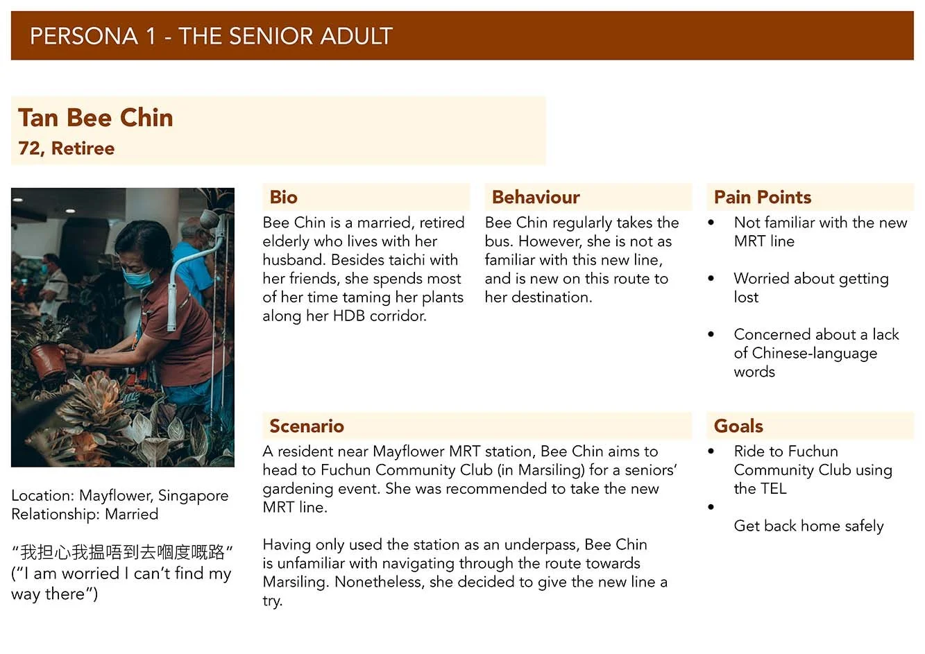
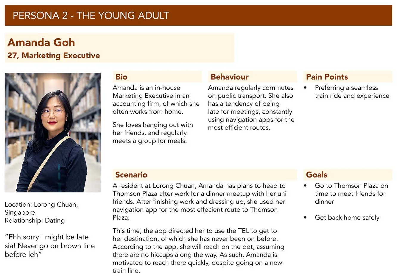
Personas
The Main insight
Commuters want to know what they need to know, and know it quickly. (keyword: what)
From such research, several insights can be deduced, such as:
Commuters are concerned about making the right decisions (e.g. the right station to exit), while being preoccupied in conversation or on their phones. As such, they rely on visual cues to make these decisions.
Commuters are interested in knowing where they are along the journey. These displays play a vital role in conveying this information to users.
The new wayfinding along the TEL, though useful for returning commuters, adds extra time into unfamiliar commuters’ journeys.
Design iterations
With this as a framework, I began creating iterations of the display across various scenarios.
Testing + Improvements
I also engaged previous interviewees for feedback through taking rides again on the train. Throughout the ride, the users were likewise encouraged to speak out their thoughts and experiences using the new layouts, which were shown on an iPad.
3 improvements on design iterations
The final display
The final product
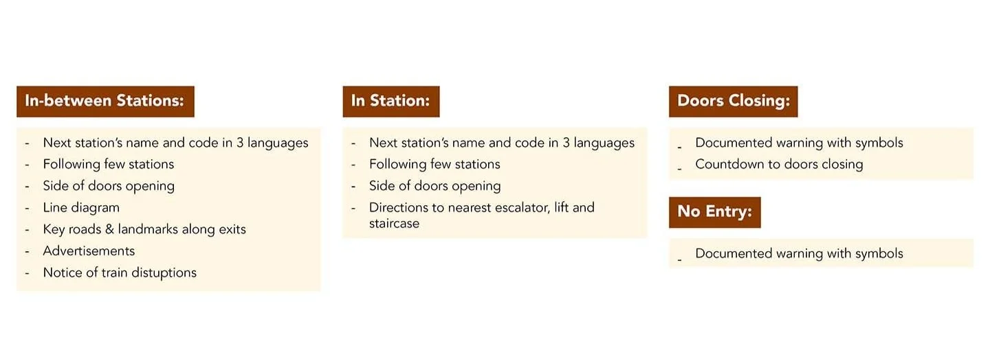
In-between stations
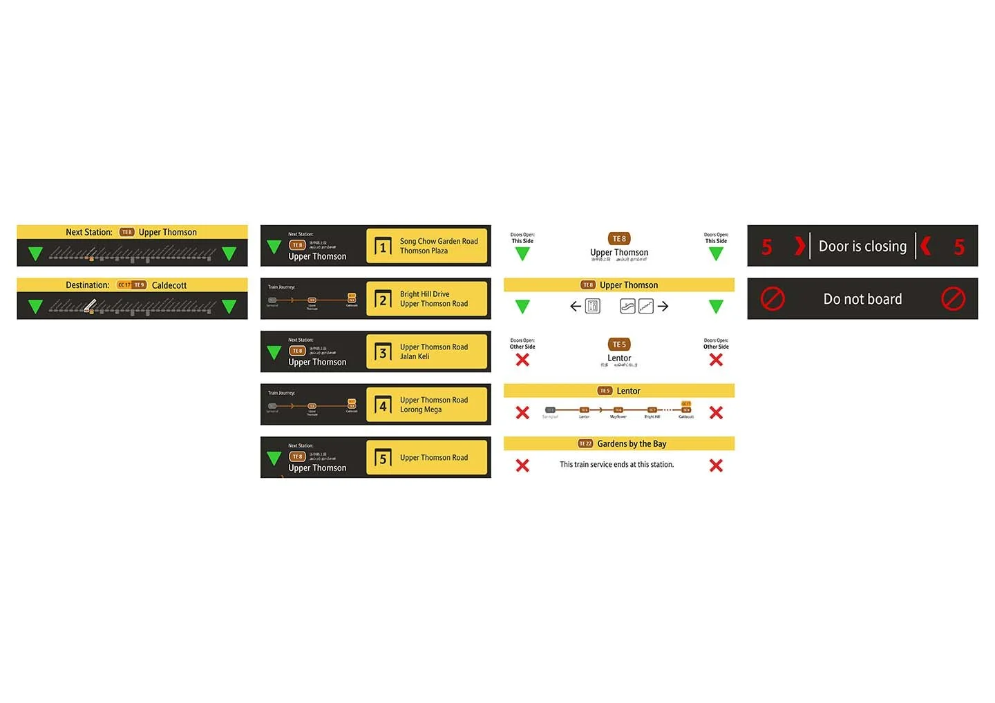
The next station is displayed in larger text, as well as several details to be viewed up close - including the line diagram, key exits, advertisements, as well as any train disruptions.
In-between stations (other side)
The screen on the other side displays the same information, except a different exit direction and a reversed map.
In a station
The screen will display the station name and code, the door open direction, as well as wayfinding to the nearest escalator, stairs, and lift.
In a station (other side)
The screen also displays the station name, code and door direction. However it will display the train’s journey along the line.
In an interchange station
The screen will display the interchanging line’s colour on the screen, as well as the direction to the line.
Doors Closing
There will be a countdown, as well as a representative animation.
Do not board
The screen will display ‘no entry’ symbols as well as a documented warning.
Centre LCD Screen
Finally, the train’s LCD screen will display accompanying information with the displays.
Example Trip
An example of the screens displayed on a ride from TE9 Caldecott to TE8 Upper Thomson.
Conclusions + Lessons
Takeaways from my first UX Research project
Although this is not a typical UX project, I embarked on this exercise with the sole purpose of applying UX Research and Design methods. 📱 That being said, there were several takeaways from this exercise:
1. Mimic the actual situation as much as possible - One pitfall of this project was the inability to simulate my new design on the display. Granted I could not actually project the design into the train, showing pictures on an iPad is the next best thing. However, the experience of realism in this test was heavily compromised.
2. Feedback is gold (also I am not the user) - Other users are able to give insights to areas that I would easily overlook, or unable to deduce, which is valuable in the UX Design process. 🙌 The need here is the courage to seek such feedback, and the humility to act upon it.
3. Users/interviewees do not know what they want - That being said, I also learnt that users often do not give constructive solutions to problems (cue Ford’s faster horse quote). For example, no interviewee/respondent mentioned a need to include station wayfinding on the display. As such, wisdom is needed to instead discern user feedback, study the pain point and propose novel solutions itself.

