JB Hi-Fi
A revamp of JB Hi-Fi's website into a usable e-commerce website - this project focused on grasping an overview on the UX and UI Design process, including exploring basic UX methods, designing the User Interface, and developing the the site's front-end.
FOCUS AREAS
UI Design (Adobe XD)
UI Development (HTML5, CSS3, JavaScript)
Project type
Individual school project (part of INFO20005)
Duration
12 weeks (Mar - Jun 2021)
The Scenario
Tidying up a well-loved brand for the future
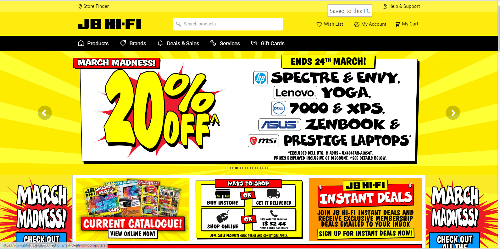
This case study sought to create a website for JB Hi-Fi Australia which is usable, efficient and intuitive, in order to increase purchases made through the website. Currently, this website features striking colours and pompous fonts, resulting in a messy outlook and unappealing to consumers.
The Solution
The designed website features a sleeker, more organised look, while still maintaining the branding of JB Hi-Fi. The same vibrant colours are designed in place with a more readable font and careful iconography, resulting in a website which is readable and easy to navigate by users of all ages.
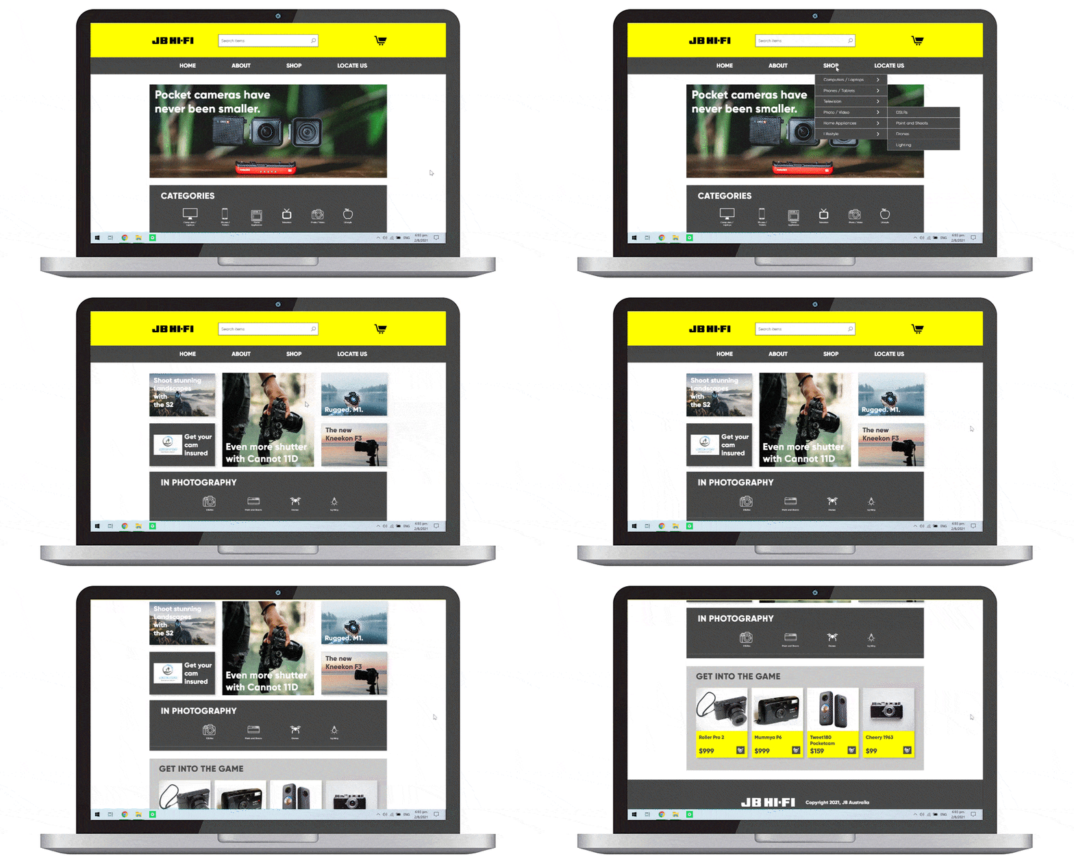
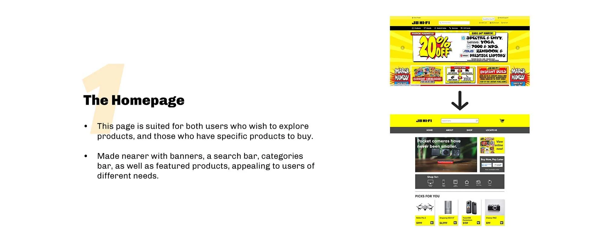
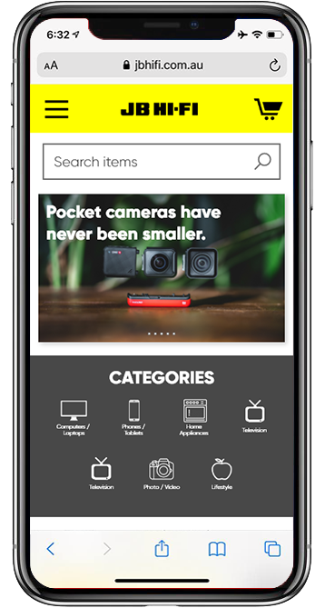
The homepage
A single banner containing images and a more readable font, and a ‘categories’ banner, allowing for easy exploration of available products.
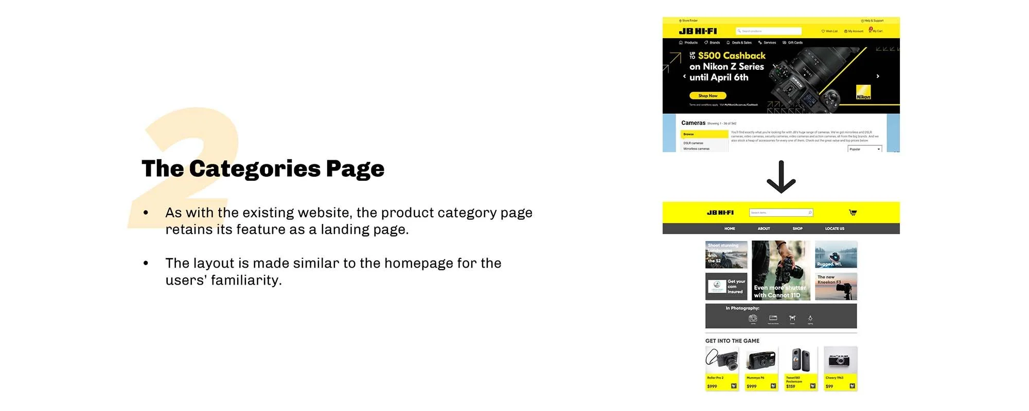
The categories page
Featuring a layout similar to the homepage, users are likewise able to explore through products in a more specific category.
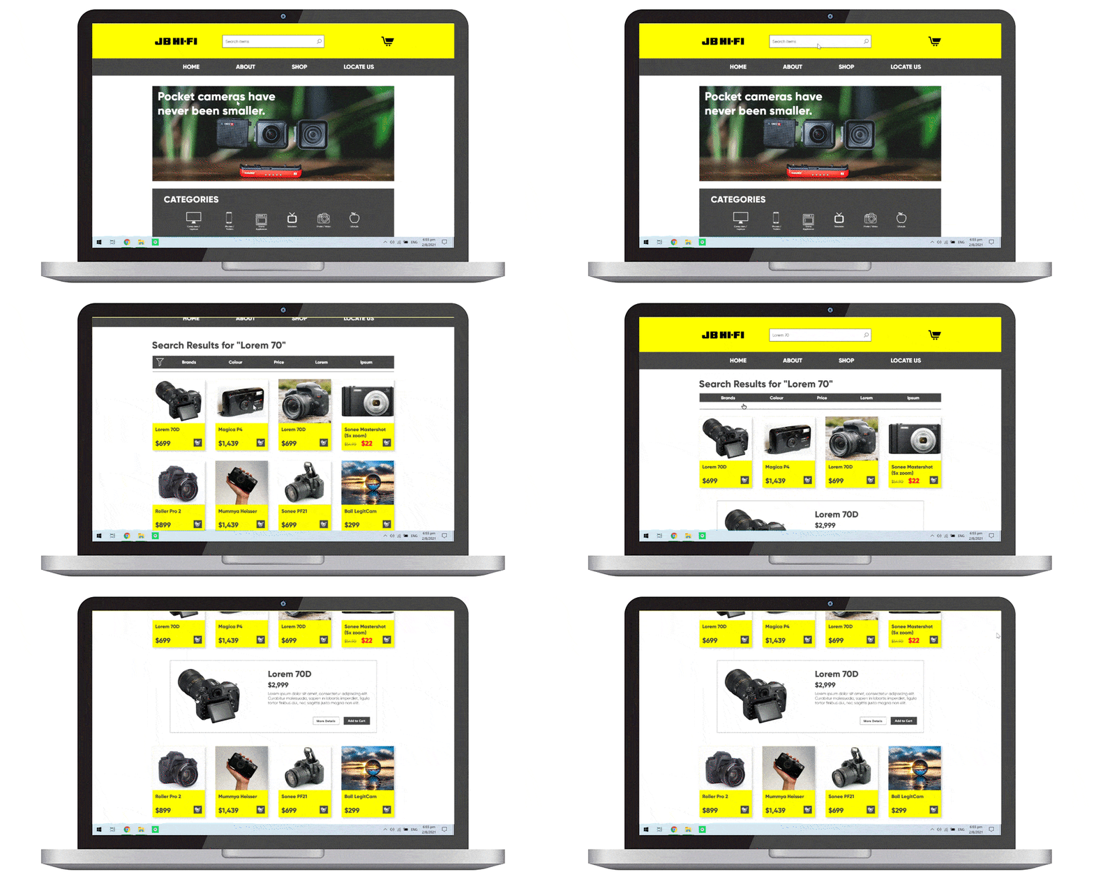
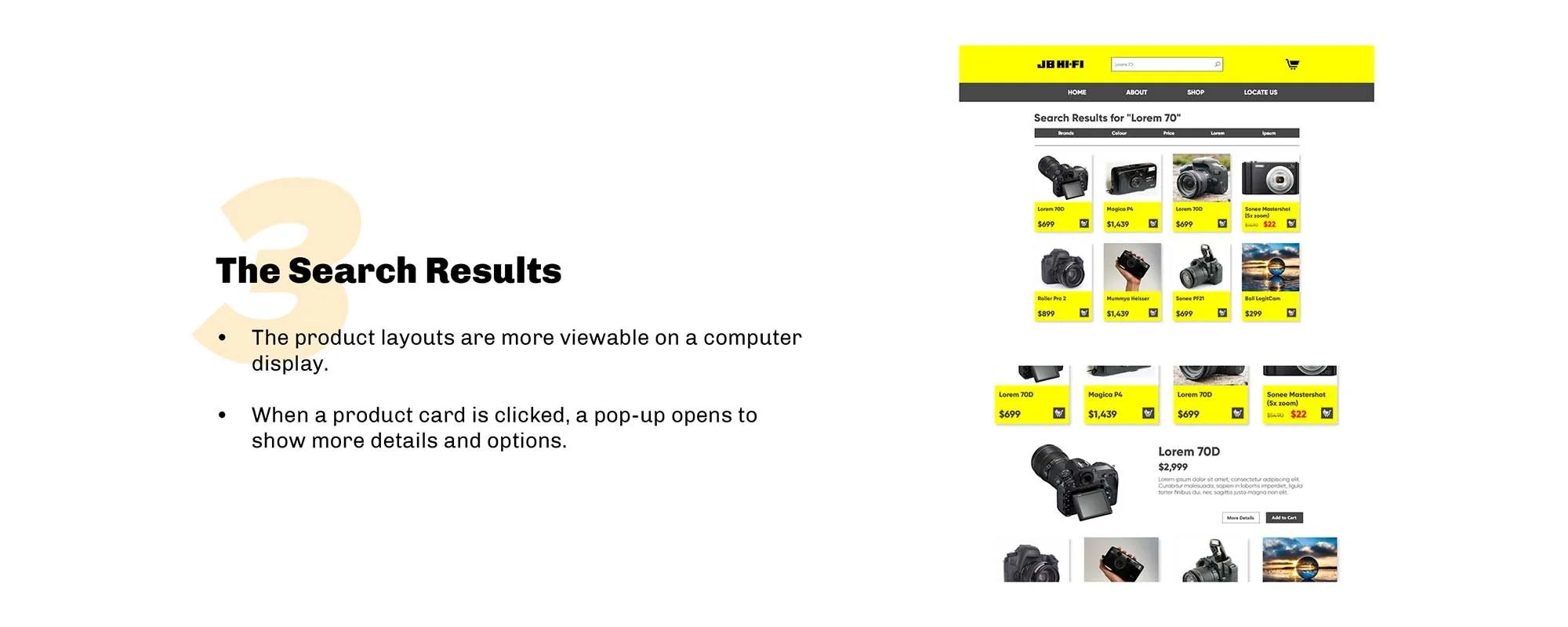
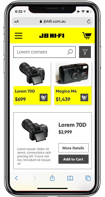
Search results
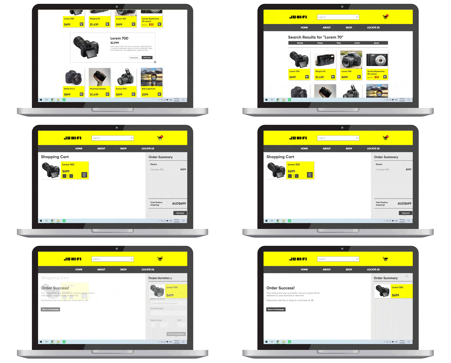
The search results are kept neatly in cards, separated by clear borders and shadows. When a product is clicked, the site expands to display more information and options to see more details or to add the product to cart.
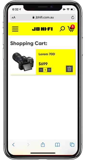
Shopping cart and checkout
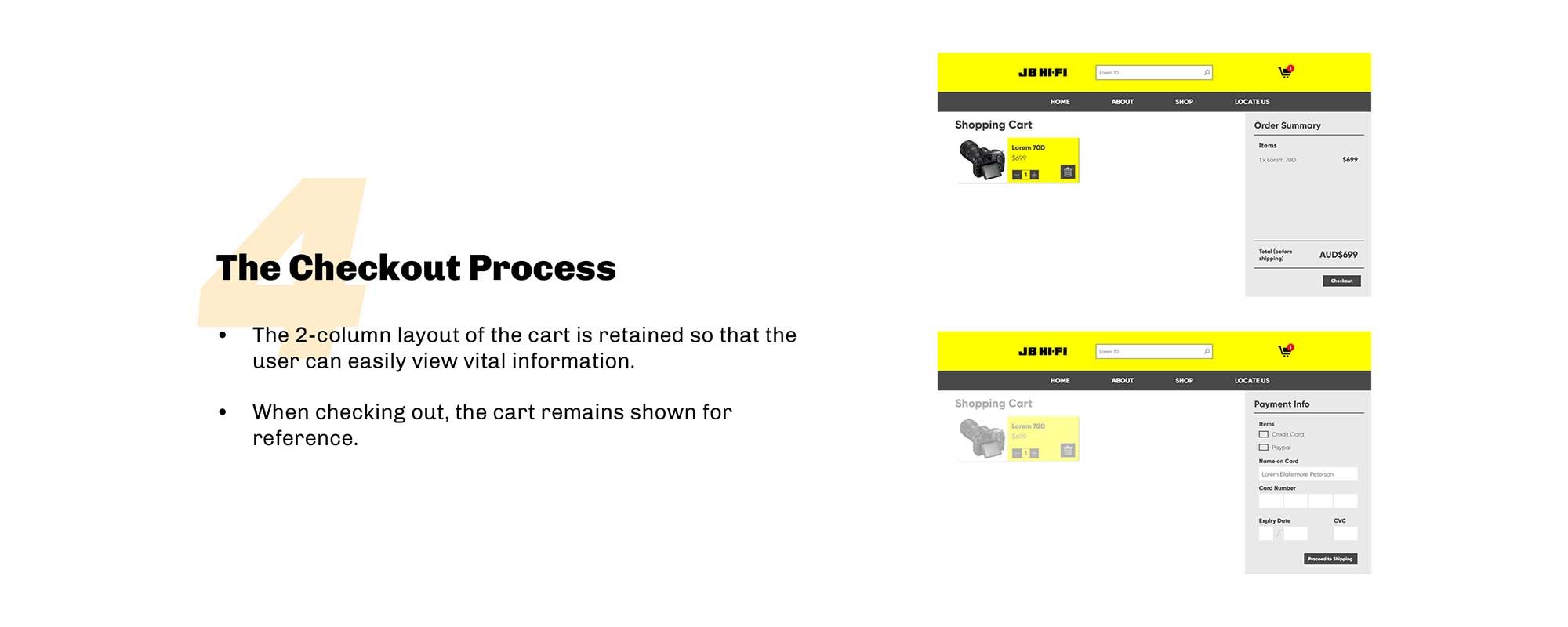
The cart features two columns - an overview of products and an order summary - in order to optimise screen space. This view is retained through the checkout process for ease of reference.
The Business Research
An initial research aimed at identifying JB Hi-Fi’s business goals and challenges, in order to determine how the new website can incorporate both user needs and business goals.
Business Audit
JB Hi-Fi is an electronics retailer in Australia, known for its lower costs for goods in this market due to several strategies:
Focusing on core activities operations, actually selling products at a lower cost, and marketing its low prices accordingly (e.g. through striking colours and emphasis)
Competitor Analysis
Competitors: Other stores selling electronics (e.g. Retravision, Harvey Norman) and e-commerce platforms (e.g. Amazon, Gumtree).
Key insight: As commerce moves online, JB faces fresh competition in this space, hence a greater need for a stronger online presence.
UI Analysis
An evaluation of JB Hi-Fi’s website, identifying pain and pleasure points.
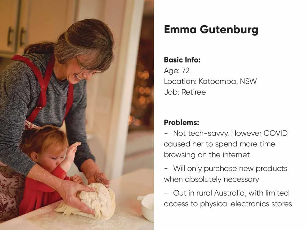
Personas
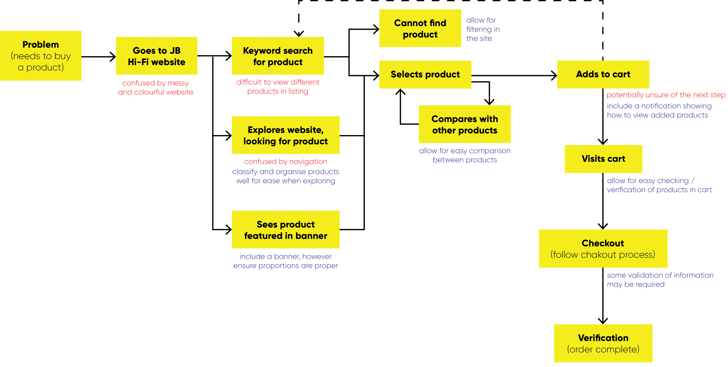
User Journey
Users’ potential steps
Determining how the users’ journey could be simplified or made more efficient.
The Design Process
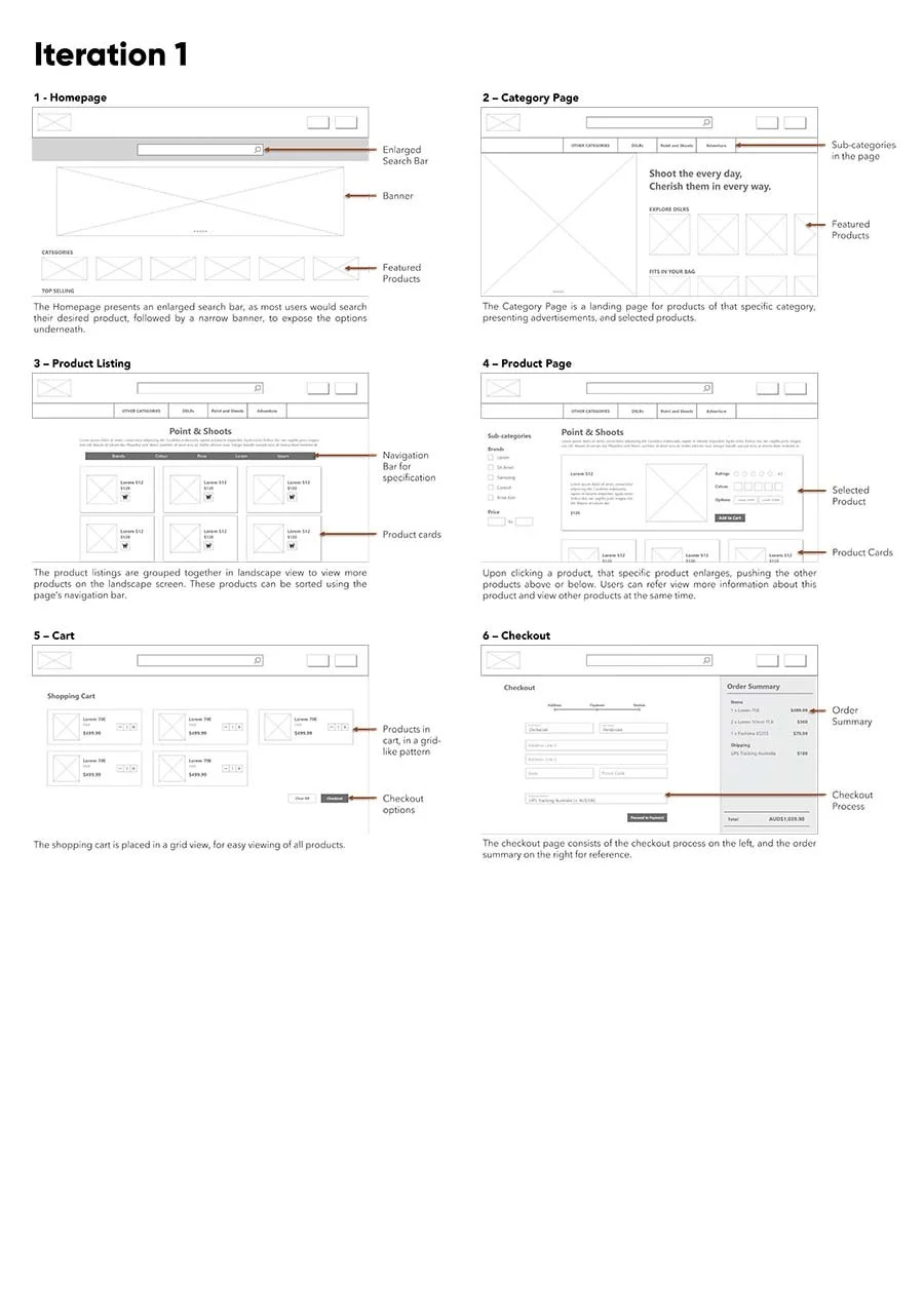
Wireframing
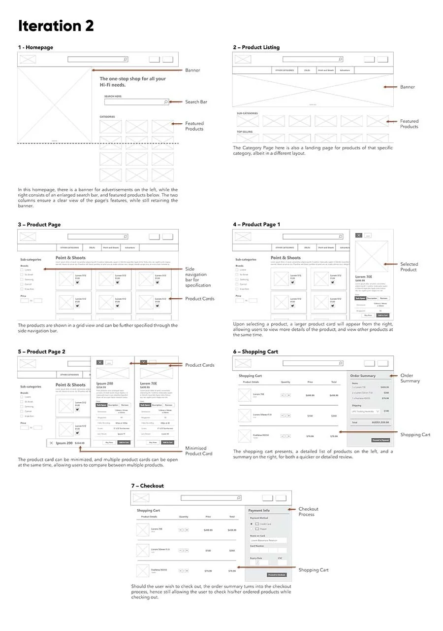
Based on the problems and opportunities identified, I iterated on low-fidelity wireframes, exploring layouts which can make the shopping process more efficient. These iterations sought to re-organise the website's features, and explore alternative features for potential readability and ease of use.
Design Iterations
I also explored possible visual design styles, cycling through different colour, font choices and layout ideas.
Design Improvements
The Final Product
A seamless online shopping process
Mobile mockups
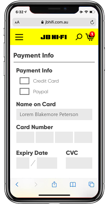
The website is also responsive, displaying information accurately yet optimised for viewing on various screen sizes.
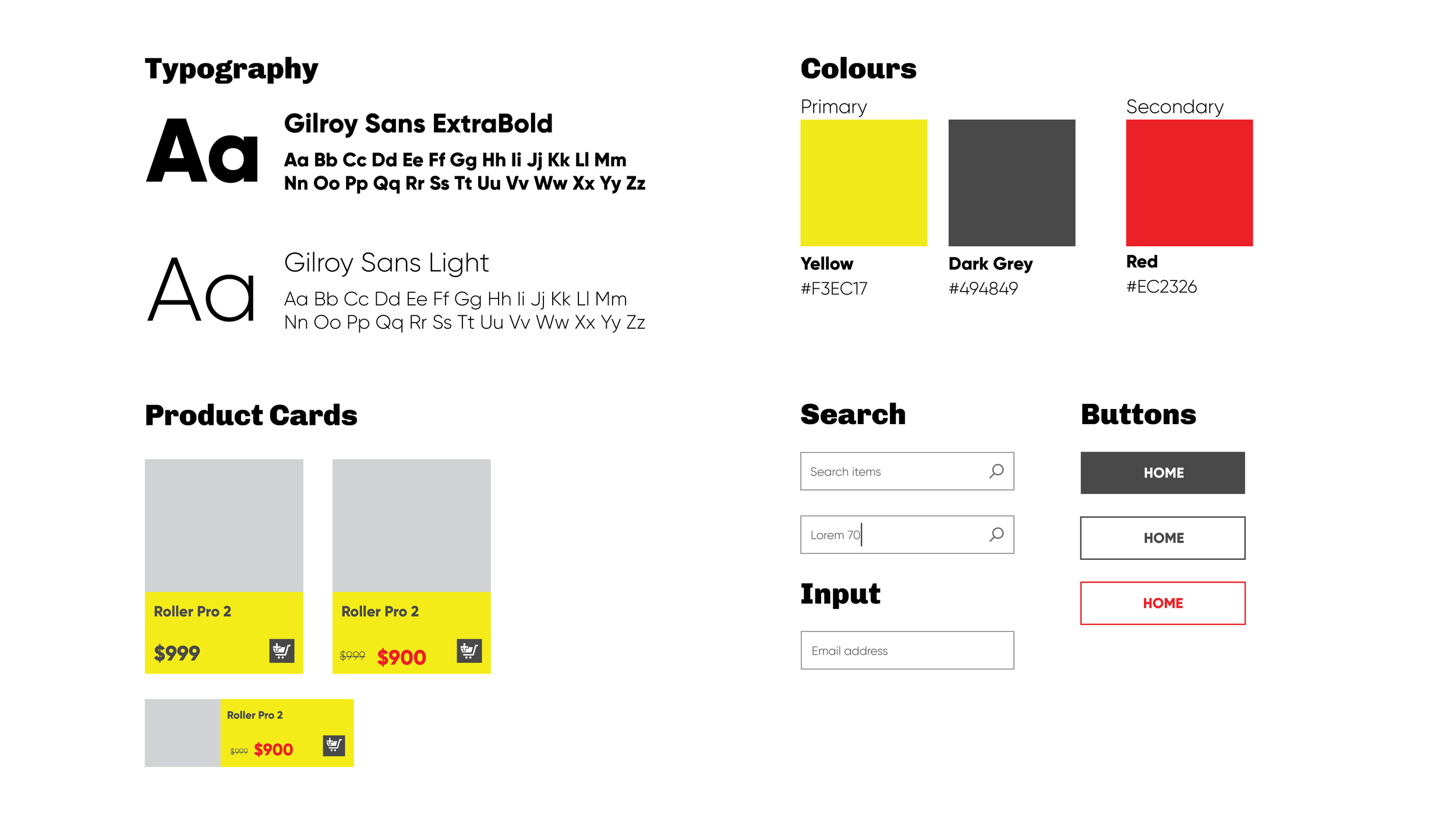
The Style Guide
Web Development
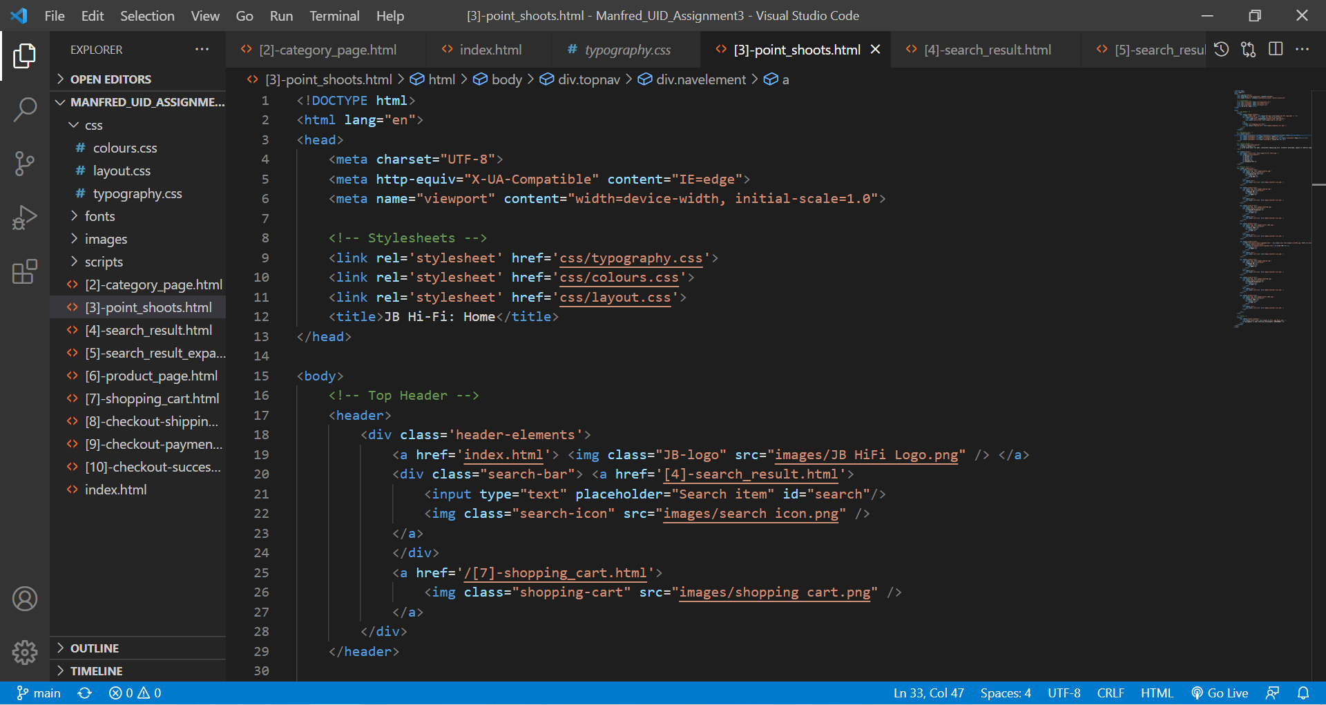
Vanilla HTML, CSS and JavaScript
The website was then developed, keeping as closely to the mockups as possible, and uploaded onto GitHub.
Looking Back
A look back from Jan 2022 🗓️
Putting this portfolio together allowed me to revisit this project 7 months on. While I am thankful for growth and improvement over the months, I can’t help but notice the pitfalls I made then.
A lack of Visual Design understanding 📱 - It was only after this project where I started to understand principles of UI design (e.g. 8-point grid, UI components). Hence this project seems messy in retrospect.
An improper design system 🎨 - The style guide used here was lacking in breadth and complexity. While sufficient to brand this design, it lacked key components — from standardised grid & spacing to button styles.
The use of repeat stock images & lorem ipsum 🖼️🖼️🖼️ - This project lacked realism due to the constant use of stock text and images. It was from this project that I learnt to design layouts — including text and images — to mimic the actual system as close as possible.
Nevertheless, this project was valuable to my UI design (and development) learning journey. For projects with better UI Design, check out the Tiles app, or the Daily UI exercises.
Conclusions + Lessons
My first individual UI project (written in June 2021)
As this was my first individual UI project, I was able to start exploring UX methods and UI design on my own, conducting my own research methods, create wireframes for the entirety of the website, designing the user interface, etc. As such, I was more conversant and familiar in the design process by the end of this design phase.
I also picked up web development skills and knowledge through this project, allowing me to dive deep into HTML, CSS and plain JavaScript, and producing such a result in the end.
While this allowed me to soak my hands fully as a sole designer, more can be done with regards to the UI design, as I feel that the current UI elements (eg. product cards) were too simplistic, and hence paves the way for more exploration. In addition, more UX methods can be conducted, such as further usability testing (this was done only briefly after coming up with wireframes).
With this coding experience, I can definitely dive more into these languages, especially in areas related to UX and UI. For example, I can dive deeper into JavaScript, and start exploring frameworks such as vue.js.

